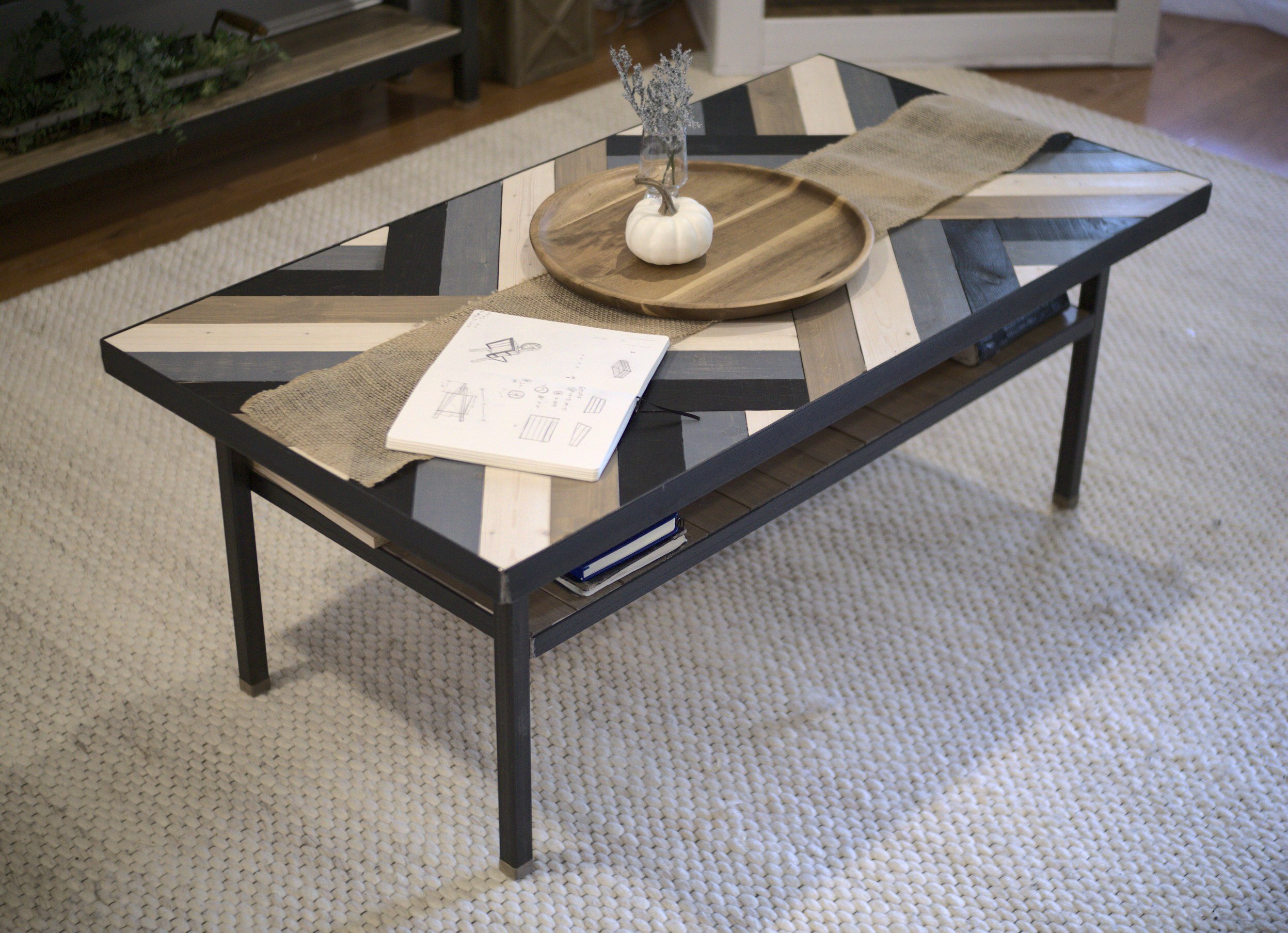
So we’re starting up the custom furniture component of our business, so we thought we’d share a couple pics of one of the early pieces we made! This modern wood and steel coffee table is one of our prototypes that we built for our own living room. We were looking for something that started to fit our brand, a reflection of what we felt Ivy & Iron should look like. (You can read more about that and us here.)
We wanted something clean but with some life and texture to it. The form had to minimal, but not so minimalistic that it wasn’t practical. So the Structure is just four straight legs and a couple horizontal planes. That’s it. Then, the Life is able to inhabit the Structure via the pattern on the primary (horizontal) surfaces and the objects which the Structure supports.

Material
So, given our brand, steel and wood are going to be some of our primary mediums. The both have their inherent qualities, and we wanted to celebrate both of them. That’s why we just did a clear seal over the deep gray mill-scale of the steel instead of painting it jet black like you see everywhere. We also stained the wood so that its grain would show through. Structure and Life; we wanted the natural texture in both.
Form
Starting at the top, having the main top surface overhang the legs helps to emphasize that plane and enforce the sense that this is a table, by definition a level surface on which objects may be placed.
Tangent Alert: One thing I don’t personally like about a lot of contemporary furniture is when the vertical frame wraps up and over right at the edges of the horizontal plane. It makes me think that the thing isn’t really a table, it’s just a prism that sits on the floor. Really, if I had my way, I’d just have floating planes with no legs at all, but the engineering required for localized anti-gravity is beyond my expertise… for now…
Anyway, as the primary surface, we knew this is where the Life would occur. Hence our interweaving, geometric pattern using multicolored stained wood. We wanted to celebrate some of that texture and give the piece some interest and play on that main surface. That level surface is the primary function of the table, after all.
Moving down, we wanted to make sure we added a secondary surface or shelf as well. We knew we’re messy people and always have some stuff (books, remotes, papers, etc.) in our living room that we don’t always want strewn on top of the visible surface. We debated whether we wanted that shelf high or low, and we decided to go high with it. This does two things: One, it helps achieve a cleaner overall feel by keeping the bottom open; and Two, it helps to hide our junk a little bit under the main surface! We also made this surface similar to the top, but more subdued, using simpler wood slats and a thinner steel frame.
Lastly, the legs we just wanted to be simple and minimal. However, to give it a level of finesse and detail, we added little wooden “feet” at the bottom. Functionally, this prevents the steel from ripping up the carpet or wood floor on which the table sits. Aesthetically, this terminates the steel and ties the legs in nicely with the rest of the piece. There’s also this tiny little anthropomorphic sense, too, that the feet should be treated with a softer touch, right? Your feet are more sensitive than your shins, yeah?

Anyway, that’s how we arrived at this design for our modern coffee table! We’re excited to begin this new phase in the business, and we’ll have more posts soon on other pieces we’ve done and some commissions we received, each with their own character and quality! We’ll also be accepting new commissions soon as well, so be on the lookout for that!
